Veri Peri: Making Pantone’s Color of the Year Work for You!
“What’s your favorite color?” The question that popped up endlessly when you were a child is one that will likely resurface in adult form when you’re deciding how to design your work or home office space.
Color impacts our mood and productivity. We hang on to the comfort that our favorite colors bring us, but color can also surprise us! Sometimes a color we thought we didn’t like ends up working for a particular purpose. At the same time, a color we thought worked sometimes starts falling flat.
Colors evolve like we do, and that’s why we get to enjoy and incorporate ever-changing color trends!
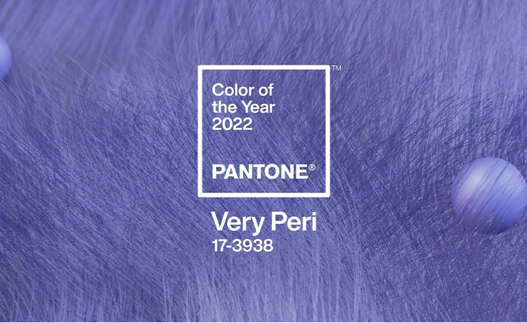
The Pantone Color Institute, trendsetting color extraordinaries, created an entirely different color for the 2022 Pantone Color of the Year: 17-3938 Very Peri.
Pantone describes Very Peri as a dynamic periwinkle hue of blue infused with an undertone of violet red. They describe it as the warmest and happiest color of all the shades of blue.
For Pantone and other companies who announce a color of the year, selecting a color requires trend analysis with inspiration from all areas of design. These colors influence purchase decisions, product development across numerous industries, and visual cues and environments around us.
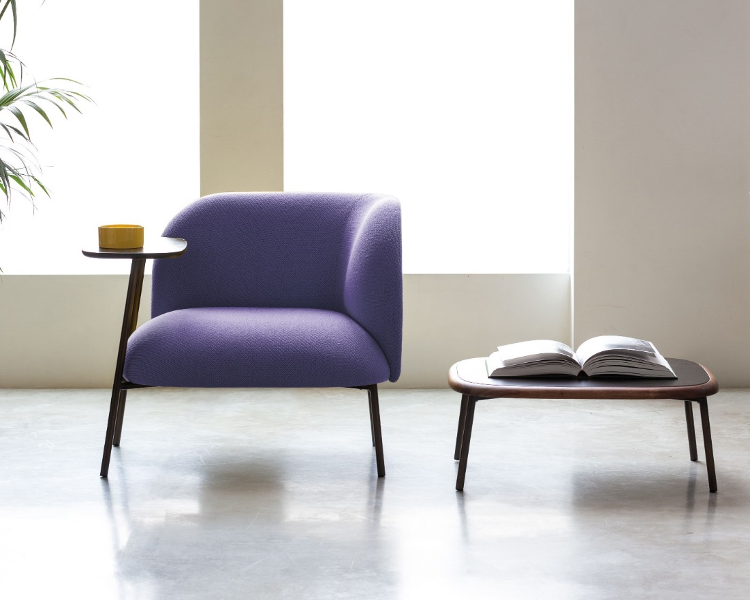
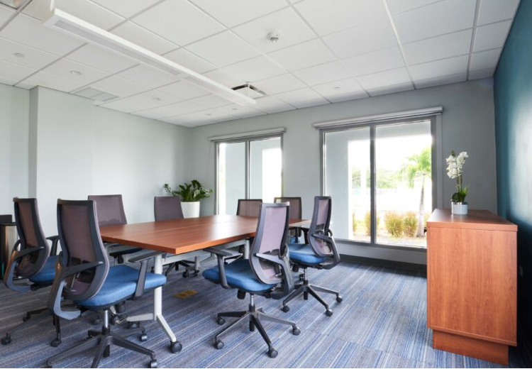
Furniture Soup can help you work the year’s colors into your space’s design. Veri Peri and other shades of periwinkle can add a freshness to sophisticated or casual spaces.
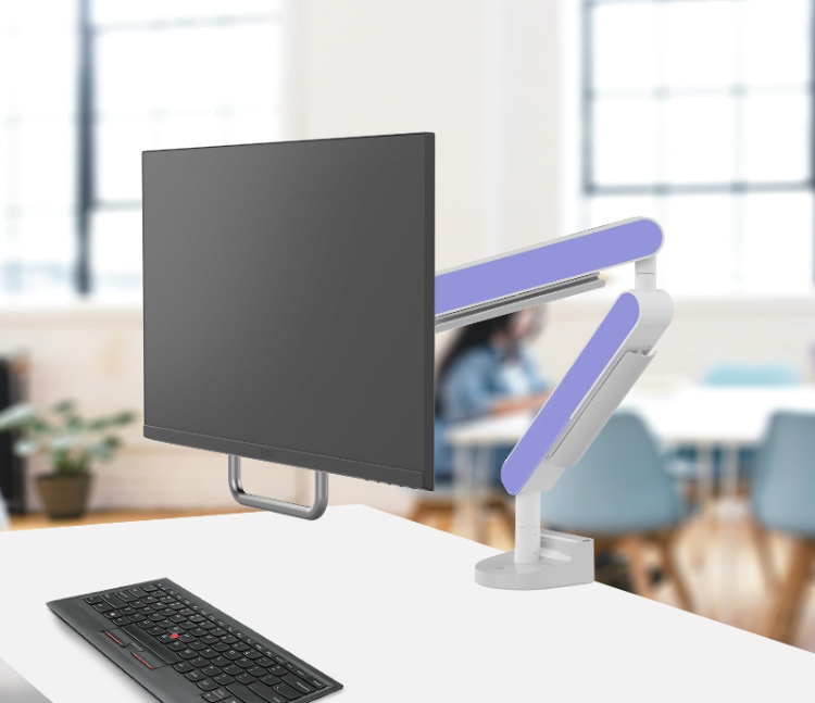
Consider infusing the color in your office space in carpet tile or other flooring options. Accent furniture (think desk chairs or lobby lounge chairs) in Veri Peri would also be a fun way to utilize the eye-catching color. Or start small with cushions and throws in periwinkle hues to incorporate the color into a waiting area or breakroom.
You can also freshen up the paint on your walls, whether through an accent wall (they’re back!) or in a space like a conference room or bathroom.
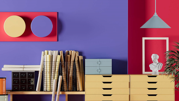
This year’s color of the year can stand alone or be paired with a variety of other colors for a satisfying outcome. Tie it in with some bold reds for an Americana look or with a bright yellow for an energizing combination. Pair Veri Peri with white for a cleaner makeover.
Since periwinkle is composed of red and blue, it also shines alongside blues. Blue is notorious for being calming, and we think the two colors look fantastic together. To achieve a modern look, you could use the color in geometric or color block painting.
Our team at Furniture Soup works with clients to hear what they need to make a space work for them. With the help of colors, we can breathe life into a design to make it feel like yours alone. More people are working from home than ever, which makes setting up a home office space a top priority. We’re here to help!
Furniture Soup works with clients from Lancaster, PA, Reading, PA, and the greater Philadelphia area, and we want to be the only company you turn to when it comes to outfitting your corporate or home office space. Whether you’re searching for conference tables for sale, office flooring companies, or any of the many other services we provide, contact us today to discuss how we can bring your vision to life!